

The Power of Color: How to Harness Color Theory in Your Artwork
Color is one of the most powerful tools at an artist's disposal. It has the ability to evoke emotions, convey meaning, and captivate viewers in ways that words cannot. Understanding color theory is essential for any artist looking to create impactful and visually compelling artwork. In this article, we'll explore the fundamentals of color theory and how you can use it to enhance your artwork.
Understanding Color Theory:
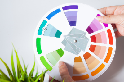
Color theory is the study of how colors interact with each other and the impact they have on human perception. At its core, color theory is based on the color wheel, a visual representation of the spectrum of colors arranged in a circle. The three primary colors—red, blue, and yellow—form the basis of the color wheel, with secondary colors (orange, green, and purple) created by mixing primary colors together.


Using Color Harmonies:
Color harmonies are combinations of colors that are aesthetically pleasing to the eye. By understanding the relationships between colors on the color wheel, artists can create harmonious color schemes that enhance the visual impact of their artwork. Some common color harmonies include:
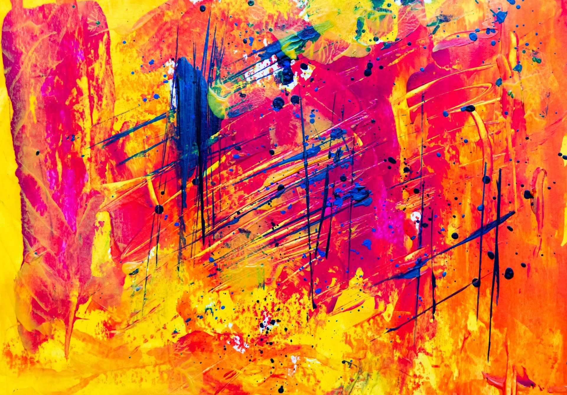
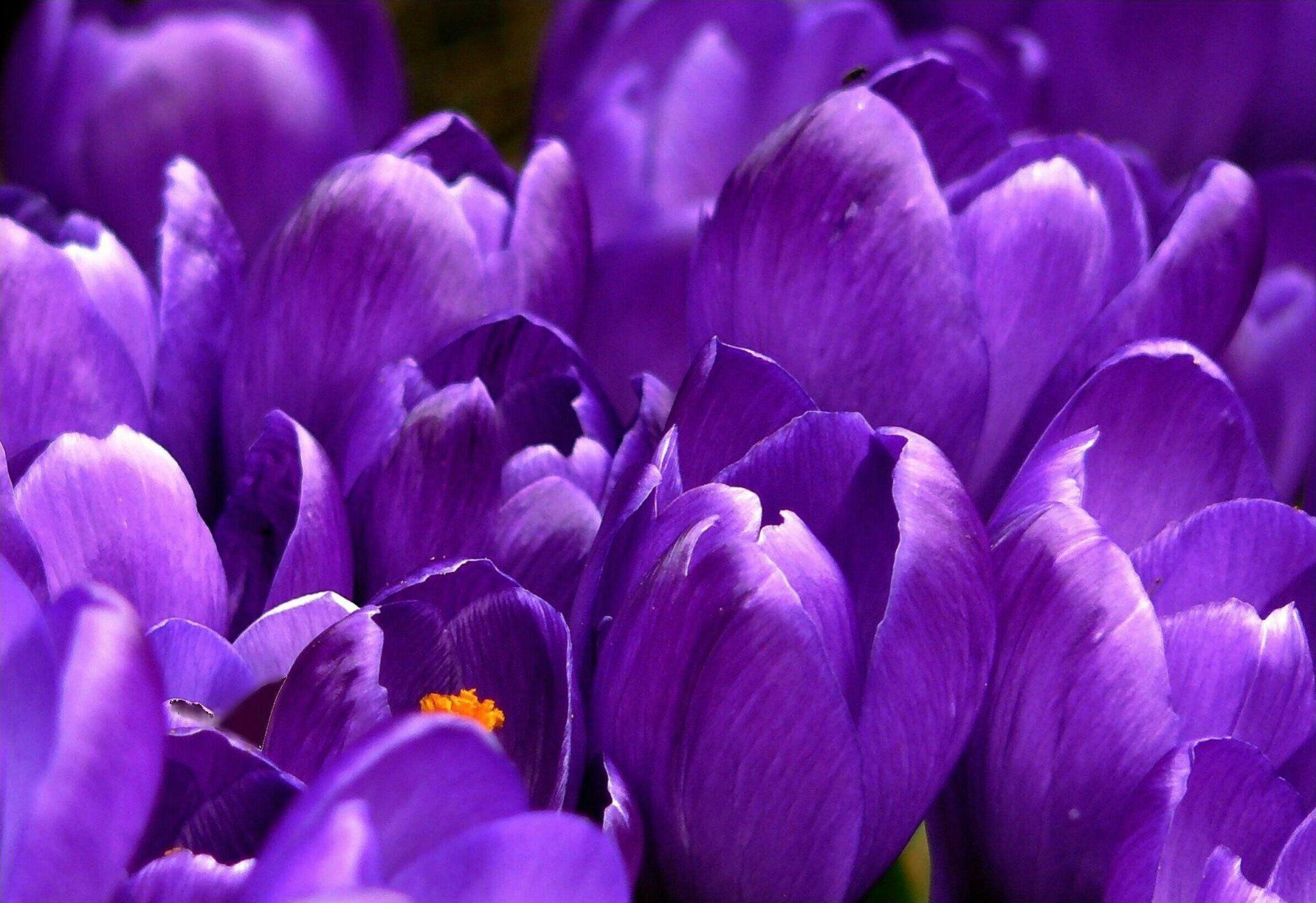
- Complementary Colors: Colors that are opposite each other on the color wheel, such as red and green or blue and orange. Complementary colors create strong contrast and can make each other appear more vibrant when used together.
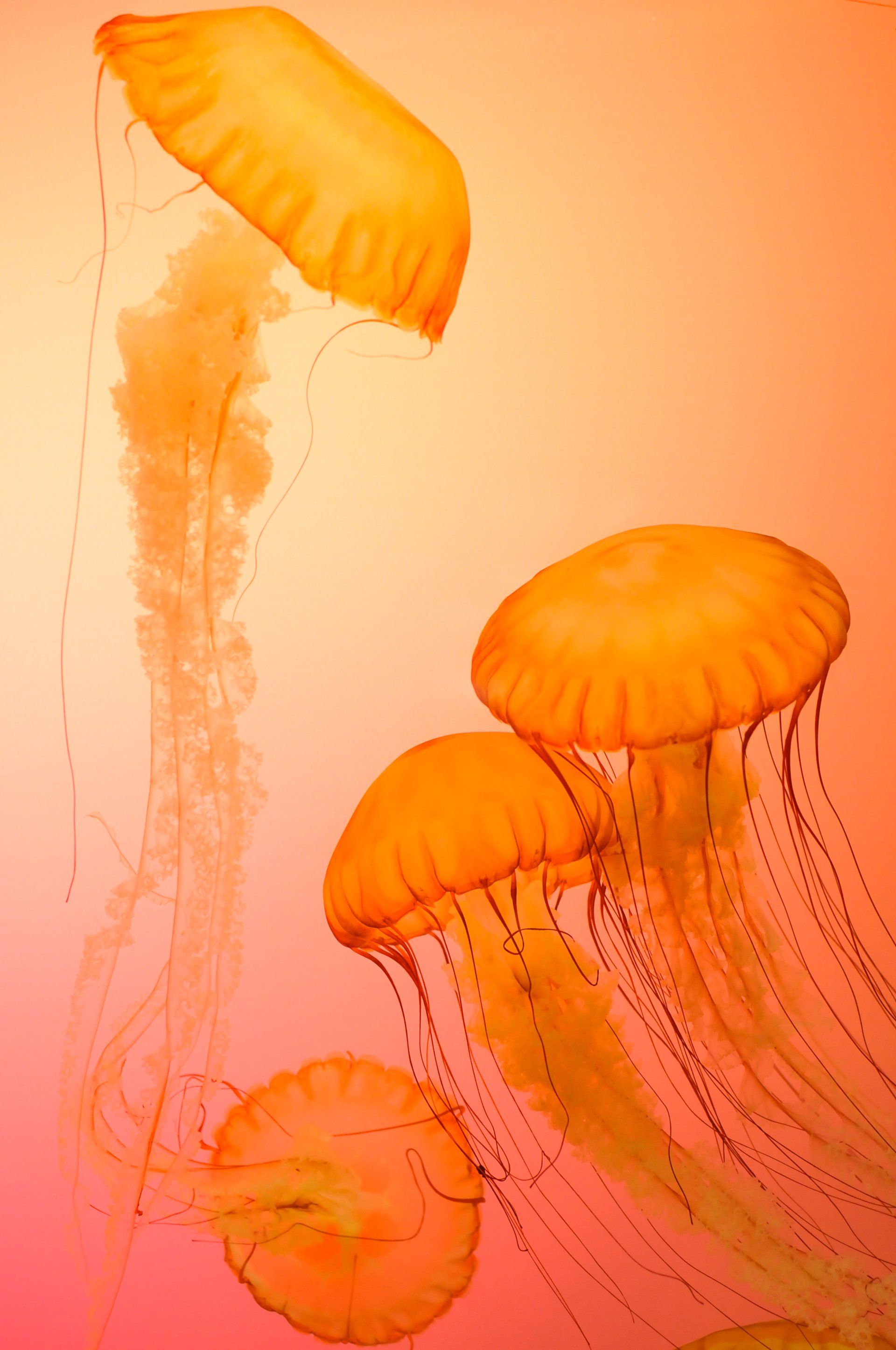
- Analogous Colors: Colors that are adjacent to each other on the color wheel, such as red, orange, and yellow. Analogous color schemes create a sense of harmony and unity and are often found in nature.
- Triadic Colors: Colors that are evenly spaced around the color wheel, forming an equilateral triangle. Triadic color schemes create a dynamic and balanced composition and offer a wide range of possibilities for experimentation.
Using Color Contrasts:
In addition to harmonious color schemes, artists can also use color contrasts to create visual interest and impact in their artwork. Some common types of color contrasts include:
- Value Contrast: Differences in lightness and darkness between colors. High-value contrast creates strong visual impact, while low-value contrast creates a more subtle effect.

- Temperature Contrast: Differences in warmth and coolness between colors. Warm colors (such as red, orange, and yellow) evoke feelings of energy and warmth, while cool colors (such as blue, green, and purple) convey a sense of calmness and tranquility.

- Saturation Contrast: Differences in intensity or purity of colors. High-saturation colors appear vivid and intense, while low-saturation colors appear more muted and subtle.
Practical Tips for Using Color Theory in Your Artwork:
- Start by experimenting with basic color schemes and gradually expand your palette as you become more comfortable with color theory.
- Pay attention to the emotional and psychological effects of different colors and use them strategically to convey the mood and atmosphere of your artwork.
- Consider the cultural and symbolic associations of colors and how they may influence the interpretation of your artwork by viewers.
- Don't be afraid to break the rules and experiment with unconventional color combinations. Sometimes the most interesting and dynamic artwork comes from pushing the boundaries of traditional color theory.
Color theory is a powerful tool that can elevate your artwork to new heights. By understanding the principles of color harmony, contrast, and symbolism, you can create visually stunning and emotionally resonant artwork that captivates viewers and leaves a lasting impression.
Other Inspirations
The Art Lovers Blog